Pepco
Website for a European chain of stores
;)
Pepco is one of the largest store chains in Europe.
Its offer includes women's, men's and children's clothing, toys, as well as industrial and decorative articles for home and everyday use. Everything at affordable prices.
Pepco currently has over 2,000 stores in 19 countries in Central and Eastern Europe. The brand is considered one of the largest retail chains in this region.
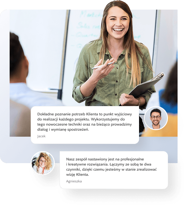
Great people to work with! Always full of enthusiasm, smile and zest for action? They bend over backwards to help at all times. We have been working together for several years and there are no signs of any changes.
The biggest of our challenges!
We approach each project with commitment and professionalism. We love challenges, and working for Pepco was one of them. This is confirmed by the numbers below:
2346
Work hours
on the project
Such an extensive project required our time, which we made the most of to meet the client's expectations.
836
Emails exchanged
during work
Efficient communication and exchange of information allowed us to learn about the client's needs and fully implement the project according to his expectations.
548 k+
Lines of code
in the repository
Pepco is one of the most extensive projects we have implemented, also in terms of the number of lines of code.
Project timeline
Work on such a large and extensive project required a precise, multi-stage plan that streamlined the activities.
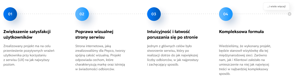
An orderly, systematic process
We implemented the project in four equally important steps: research, design, programming and implementation. Our team, by carrying out its activities at several stages simultaneously, was able to create an attractive and coherent whole.
An iterative approach to implementing the assumed plan
A project tailored to an international client, such as Pepco, required a plan from us, which we consistently implemented and achieved subsequent goals step by step.

Project goals
When creating a website for Pepco, we wanted its practicality and aesthetics to meet the brand's standards. We wanted the website to be as intuitive as possible and able to meet the needs of users from all countries involved.
Research, research
and creative workshops
with the client
When implementing the project, we wanted to best identify and adapt to the client's needs, which is why we focused on a number of solutions that made it easier for us to find a way to an agreement.
- Using the card sorting method Thanks to this creative analysis, used to design user experiences, we were able to precisely understand the client's expectations and create a complete structure of the Pepco website.
- Individual approach and creativity One of the most important factors influencing the efficiency and satisfaction of creating a website for an international client was dialogue and an individual, unique approach.
Sitemap and initial prototypes
The list of all subpages we created made it much easier to understand the structure of such an extensive website as Pepco. The map and prototypes contributed to maintaining order and clarity of the entire project.
More than a dozen countries, several languages
Working for a client operating in Central and Eastern Europe required us to create 15 language versions of the website.
Adapting to the needs of an international client
For such an extensive chain of stores as Pepco, we have created as many as 16 language versions of the website. Thanks to such versatility, the brand communicates without any problems and reaches its specified target.
Individual approach to website users from Central and Eastern Europe
Each language version was created in response to the linguistic diversity of all users of the Pepco website. This allows for much more effective building of relationships between the brand and its customers.
Over a hundred graphic designs.
Fresh, minimalist, fashionable look.
Well-thought-out design allowed for conveying various content in a functional, orderly form.
- Modern design The skillful use of white space and the reduction of information mean that the recipient's attention is focused on the central, most important points of the page, and the whole thing is presented in a fashionable, minimalist style.
- Functionality and intuitiveness Taking care of the user's perception of the website, we have implemented simplified navigation and all unnecessary, distracting elements have been condensed or removed.
-
Consistency with the brand image On the website, although we used a minimalist style, we were able to maintain the colors typical of the brand and give the whole thing an individual character known to the recipients.
- Uniform, consistent style of subpages To make navigating the website as intuitive as possible, we designed and created each subpage according to a carefully thought-out and planned scheme.
- A project meeting international standards When designing a website for an international client, our biggest challenge was to adapt to comprehensive standards and aesthetics.
- Thoughtful graphic elements and typography Graphics created especially for Pepco and a carefully selected font create a unique atmosphere and an impression of transparency. The site has an individual identity and character.
Dedicated containers for packshots and banners
In order to improve the functionality and give the website a unique character, we have created dedicated elements especially for Pepco that offer a lot of possibilities.
27
Dedicated
containers
Different sizes make it possible to place any packshots, depending on individual parameters.
82
Replacement systems
components
The ability to create aesthetically pleasing compositions allows you to maintain the minimalist style of the website.
>2k
Possible
combinations
Such a large number of possibilities gives the freedom to create compositions that will be visually and functionally satisfying for the client.
MDA is not only a partner that meets our needs, but above all a team we can always rely on. They are not afraid of any challenge, and the words "it's impossible" are replaced by "we will do what we can."
Dedicated element layouts
A coherent, transparent structure was the starting point for designing the website of the European retail chain Pepco. Therefore, we have created systems dedicated to the needs and requirements of our client.
- Optimal use of space Each element on the page has its own place and assigned function. None of them are accidental.
- Easy, intuitive navigation An orderly structure and lack of information chaos were the key determinants in creating such an intuitive and easy-to-use website.
- Clear and attractive design The systematic and consistent layout that the website user encounters helps in intuitive navigation and encourages them to stay on the website.
The collection view layout can be modified in any way
We wanted our client to be able to decide on the individual arrangement of elements, tailored to individual collections, while maintaining a modern look that encourages the user to interact with the website.
The individual character of each collection
We gave the client the freedom to choose the view of each collection so that he could provide the recipients with all the information about the offered products in the most attractive and encouraging way possible.
Aesthetic and orderly layout
Each collection of the Pepco chain has its own individual, unique atmosphere and character. The variety of products offered gave us a challenge to implement the possibility of modifying systems in such a way that they always create an aesthetic and coherent whole.
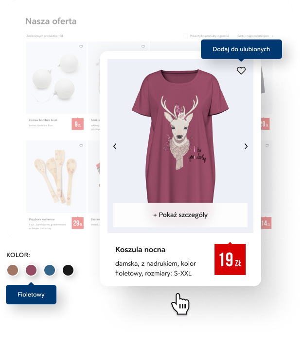
New leaflet, new quality
The completely new look and feel of the leaflet allows the user to get acquainted with the store's current offer in a simple and pleasant way. Thanks to the pins attached to each product, the recipient can preview the product they are interested in and add it to their favorites. All products included in the leaflet are grouped by category with the option of quick preview. We have made browsing the store's current offer convenient and intuitive.

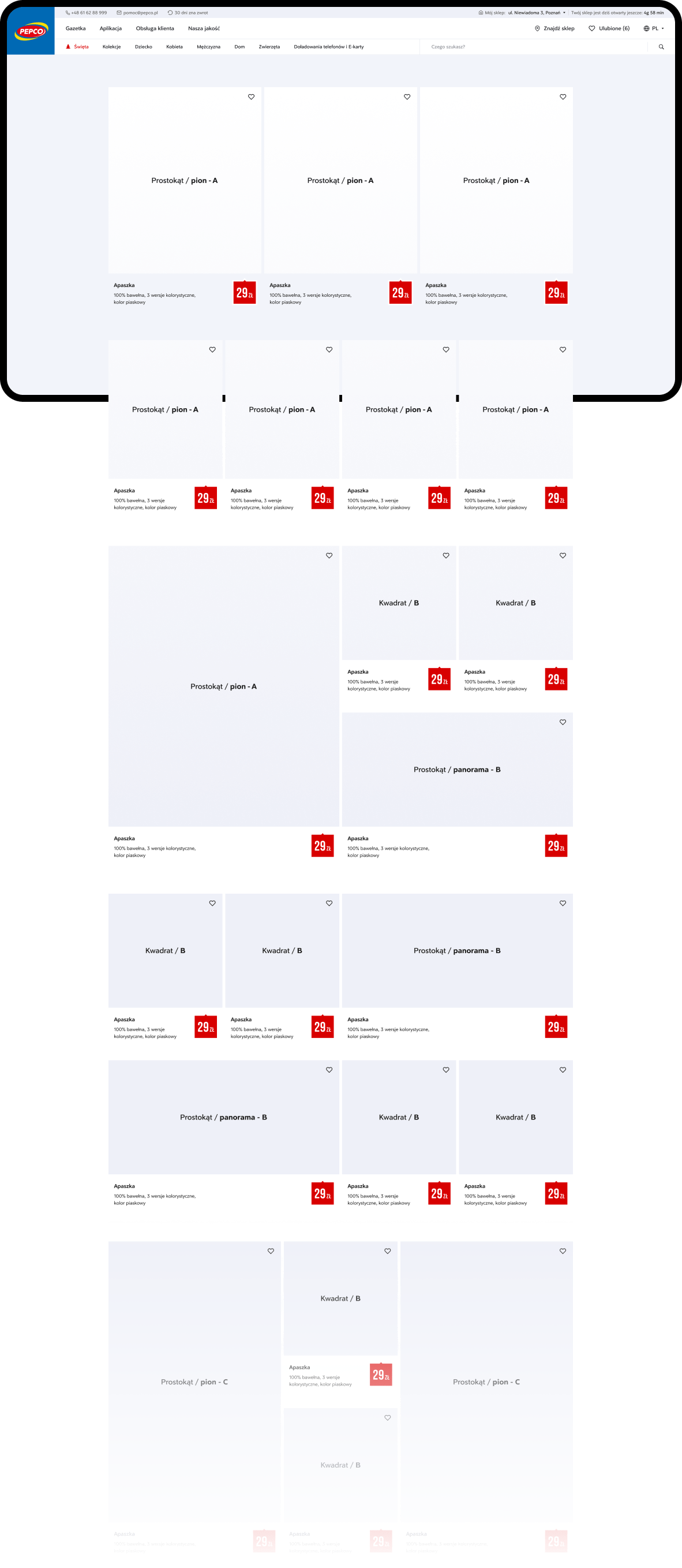
New product tiles
When creating a website for a chain of stores such as Pepco, the key element was to design functional tiles that would best present the offered products, providing maximum information about them.
- Orderly diagram All product tiles on the website have been arranged according to a uniform scheme, which optimally uses the space of the website and makes the whole thing stylistically match the other elements of the website.
- Quick content verification Thanks to the consistency and transparency of the layout, the user can freely browse through the products that interest him. We have implemented the ability to add them to your favorites and quickly preview different color versions.
New functionalities on the website
To make navigating the new Pepco website even easier and more personalized, we have implemented specially designed functions:
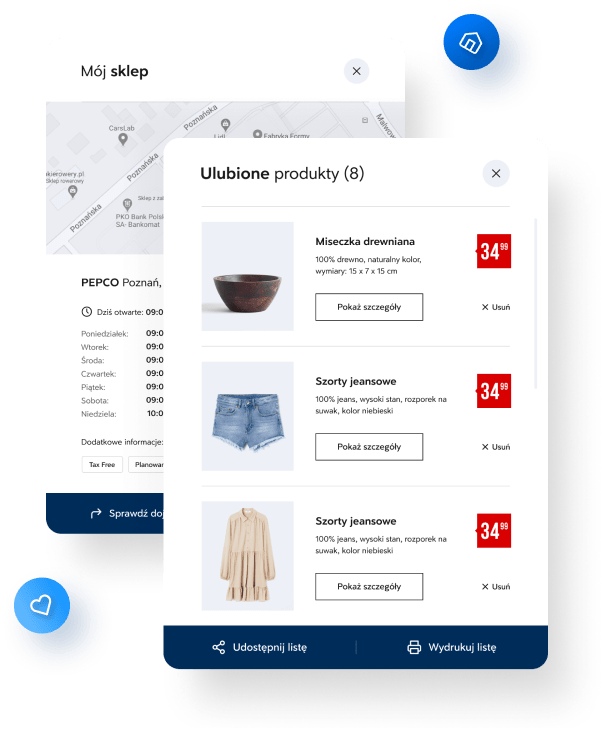
My shop
After entering the city or postal code, the user can quickly find stores in a given area and locate them on the map. Each one has been marked with a visible pin, and the search results include opening hours and the ability to check directions.
Favorite products
By adding selected products to favorites, we gave recipients the opportunity to create a personalized list of favorite products. The resulting list can be printed or shared to easily find the products you like in a stationary store and enjoy shopping satisfaction.
New navigation, easier access to products
The goal we achieved was to create a website that would promote the products offered by the Pepco chain of stores in a user-friendly way.
- A clear offer We made sure that the Pepco chain's offer was precise and that the user could easily find his way around and locate the products.
- Easy navigation We have grouped all products into categories so that the user can easily find the product he is interested in or is currently looking for.
- Convenient browsing With such an extensive offer as Pepco, it was important to enable the user to become familiar with it as conveniently and intuitively as possible.
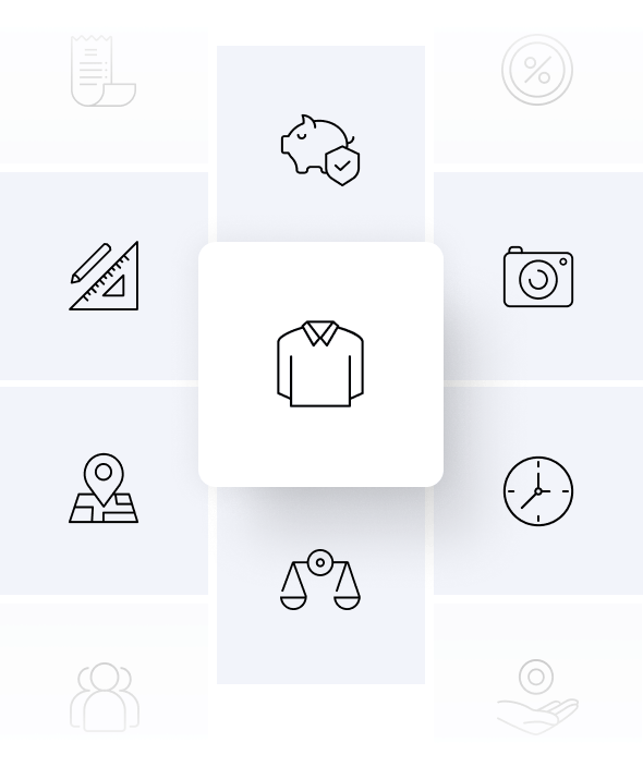
Over 50 dedicated icons
Our team designed icons for Pepco, which additionally enriched the content on the website and complemented its overall design.
- Pleasant learning of the content Icons specially designed for our client's industry and image not only improve the website's design, but also make it easier to navigate and read the content.
- Stylish design The icons fit perfectly with the other graphic elements of the website, making the whole thing look aesthetic and modern.
Grid adapted to every device
We know perfectly well that proper website responsiveness is essential for its positive reception by the user. We have adapted the appearance and functioning of the Pepco website to the devices used by modern customers.
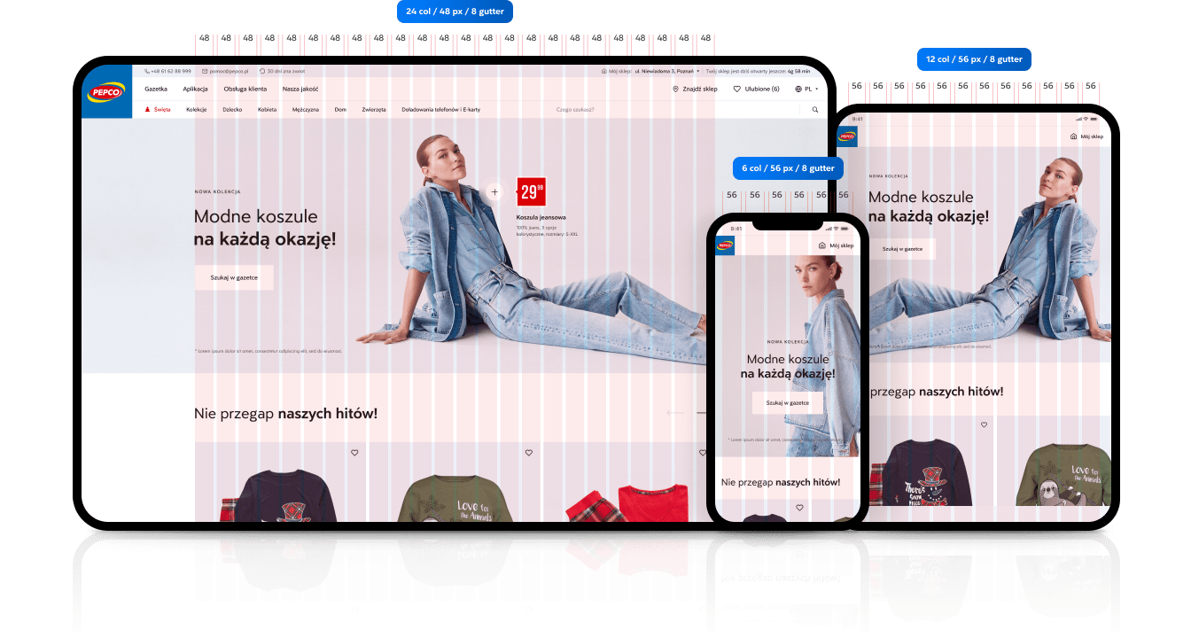

Responsive version of the website
In order to adapt to the modern recipient, we have created a fully responsive website that adapts to the variety of devices used.
For the benefit of the client
By creating a fully responsive version of the website for our client, he did not have to worry about working on multiple versions and layouts of his website. The website layout adapts to the device the user is currently using.
Convenience for the recipient
We know perfectly well that a website with a high level of responsiveness will encourage the recipient to stay on it for a longer time. The project we implemented for Pepco assumed comfort and functionality that everyone would experience, regardless of the device they use.

Multisite CMS, high speed
Such an extensive website and the number of its language versions required the use of modern solutions to make its management as easy as possible.
Custom roles, controlled access to content
During the project, we went beyond the standard settings and created custom roles with individual permission groups for Pepco.
Individual permission groups
To give the client even greater freedom and ease of operation, we have created the possibility of assigning roles to individual groups that have access only to selected modules, sections, pages or settings.
Endless possibilities
Thanks to the fact that we created the Pepco website from scratch, depending on the needs, we are able to expand the created network of roles with new ones, with new rights to selected sections.
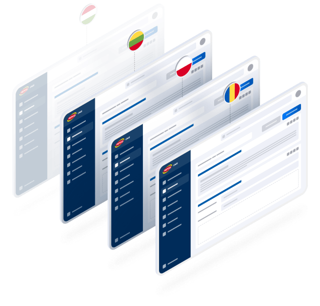
Section management depending on language
Creating so many language versions of the website for Pepco was a real challenge for our team. We wanted each version to stand out in its country and reach its audience as best as possible.
Targeting individual needs
We wanted each version to work optimally for the requirements of a given language. So that the customer can freely edit and add content to the selected version.
Synchronization of language versions
We made sure that all language versions of the website work on a mirror image basis, and the recipient of each version receives the same information.
Technologies used
The website was created based on the WordPress system. Proper and reliable preparation of this type of software translates into its high security and reliability. The WordPress system is also very flexible - it allows the client to make changes to the website on his own. All this thanks to an easy-to-use content management panel.
When programming, we used the following languages: JS, HTML, PHP, jQuery, CSS. Moreover, when implementing such an extensive project, we used the WP Multisite tool and implemented maps based on OpenStreetMap.


Write to us and...
Let's get to work!
We will gladly answer your questions and prepare a comprehensive cooperation offer!