G.EN.
Website for a gas energy supplier
G.EN. is a gas energy supplier with 30 years of experience. It operates in 5 voivodeships in Poland.
They used their many years of experience in the industry to develop and expand gas networks. They reach new regions and provide gas to an increasing number of Poles.
They provide their services to both households and businesses. In addition to selling gas, they also distribute it.
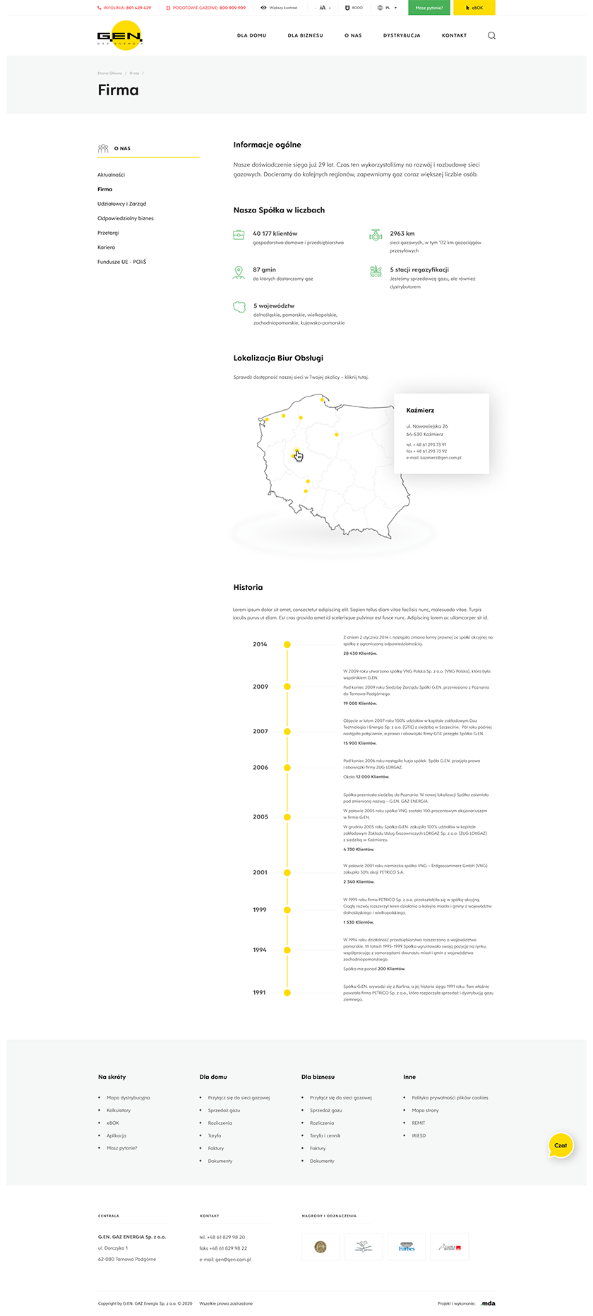
Clear and orderly layout
We made sure that the new G.EN website it was user-friendly and therefore a showcase of the company. We love the combination of these two features, which we always complement with carefully selected graphics and colors. The effect of a coherent whole and full customer satisfaction has been achieved.
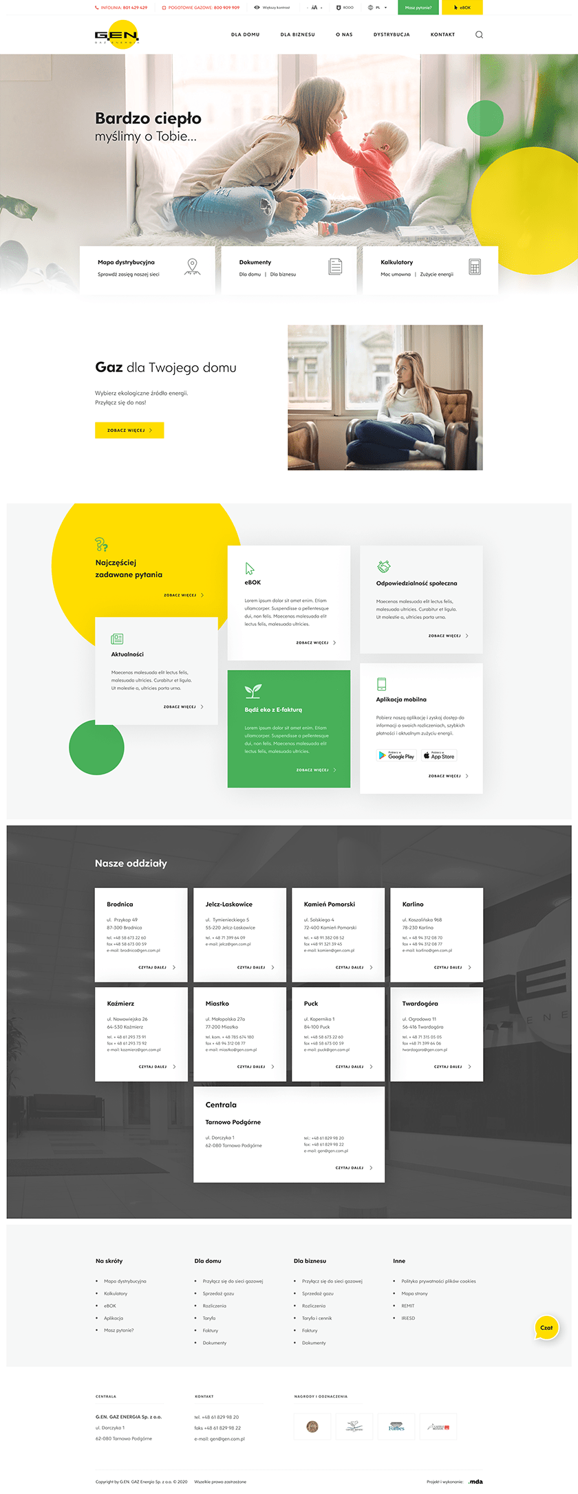
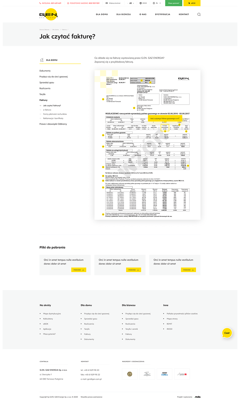
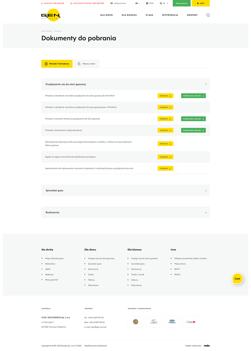
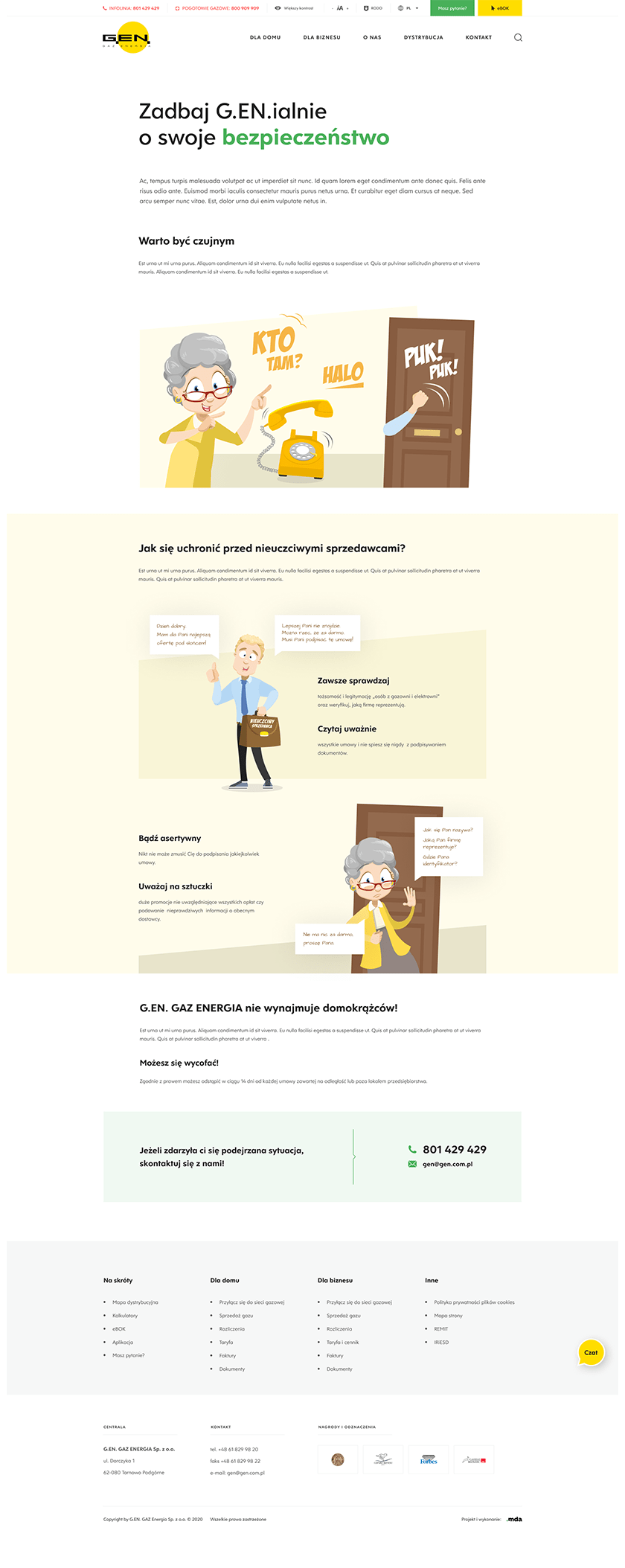
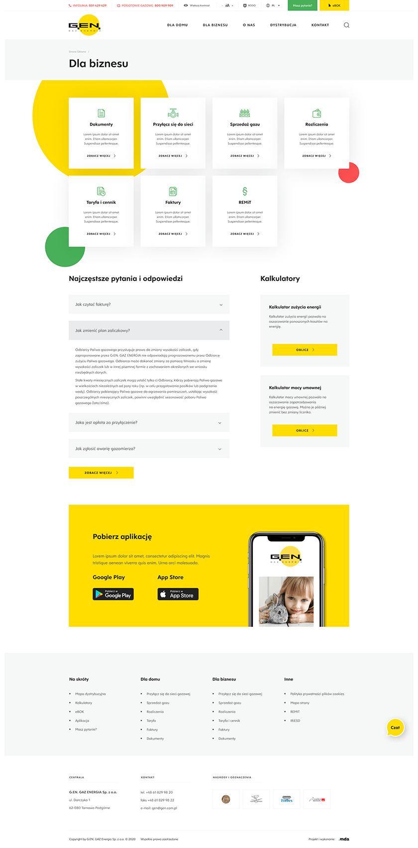


Front to the customer and user
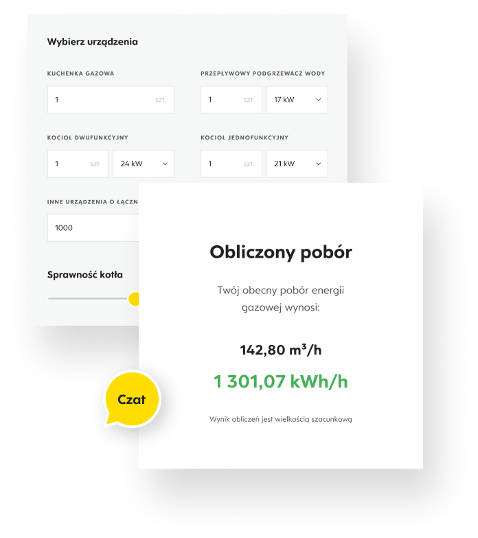
On the G.EN website we have implemented completely new functionalities that will allow the client to better contact the user, encourage interaction with the website and quickly estimate the contracted capacity or gas fuel consumption in m3 per billing unit, i.e. kWh.
- Contracted capacity calculator All the user needs to do is complete the required data fields and the calculator will quickly calculate the current gas energy consumption - the contractual power, i.e. the hourly demand for gas fuel.
-
Energy consumption calculator
After completing a short form, the user will learn the level of his gas energy consumption. The consumption of gas fuel in m3 per billing unit, i.e. kWh, will be easily converted. -
Automatic Online Help We have made complex calculations as easy as possible. Thanks to the above solutions, the user will easily calculate the values he is interested in and will be happy to return to the G.EN website.
A large number of personalized icons, designed for the website
An extensive form creation tool
In response to the client's needs, we have created the opportunity to create their own forms, tailored to the data they are interested in and the specificity of the industry.
-
Function to create your own forms in the panel This is a huge freedom and a range of possibilities that we love to give to the client. Thanks to this functionality, he will easily generate a form that will collect the data he is interested in and will allow him to learn about the needs and expectations of users, as well as facilitate the conclusion of contracts with them.
-
Possibility to send online and aggregate data The form that our client generates according to his own needs can be sent online, and the data obtained from it can be easily combined into a whole and create a database that allows the client to efficiently get to know the user and reach him.

Fully adaptive mobile version
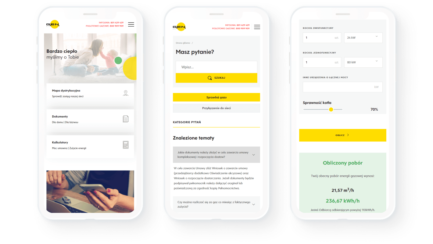
A website that adapts to mobile devices is today the basis for a company's operation on the Internet. So we created a website that every user can use, even on their smartphone.
Editable presentation templates in PowerPoint
Easy-to-edit presentation templates, made especially for our client, in a style that matches the company's aesthetics. They will make it easier and more attractive to promote the image of G.EN. both outside and within the company's internal structures.
-
SmartArt objects
Illustrations that enrich presentations and make it easier to include specific data are a key element in providing clear and reliable information.
-
Charts in Excel
Placing the data needed for presentation is even easier. Charts can be modified in the presentation in any way known from Excel.
-
Graphic elements to use When designing dedicated graphics, we took into account the specificity of the industry in which our client operates and focused on diversifying the content of the presentation.

Technologies used
The landing page was created based on the WordPress system. Proper and reliable preparation of this type of software translates into its high security and reliability. The WordPress system is also very flexible - it allows the client to make changes to the website on his own. All this thanks to an easy-to-use content management panel.
Write to us and...
Let's get to work!
We will gladly answer your questions and prepare a comprehensive cooperation offer!
;)
