
Printing house PDO
Landing Page website
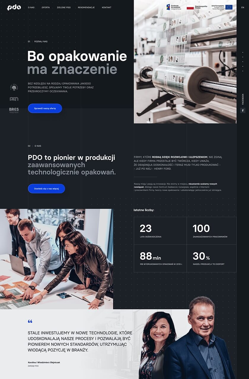
PDO is a pioneer in the production of technologically advanced packaging.
Operating in the industry for over 25 years, it constantly develops by taking up new challenges and searching for innovative, creative solutions.
The company has gained the trust of small, local enterprises and international corporations.
Website design
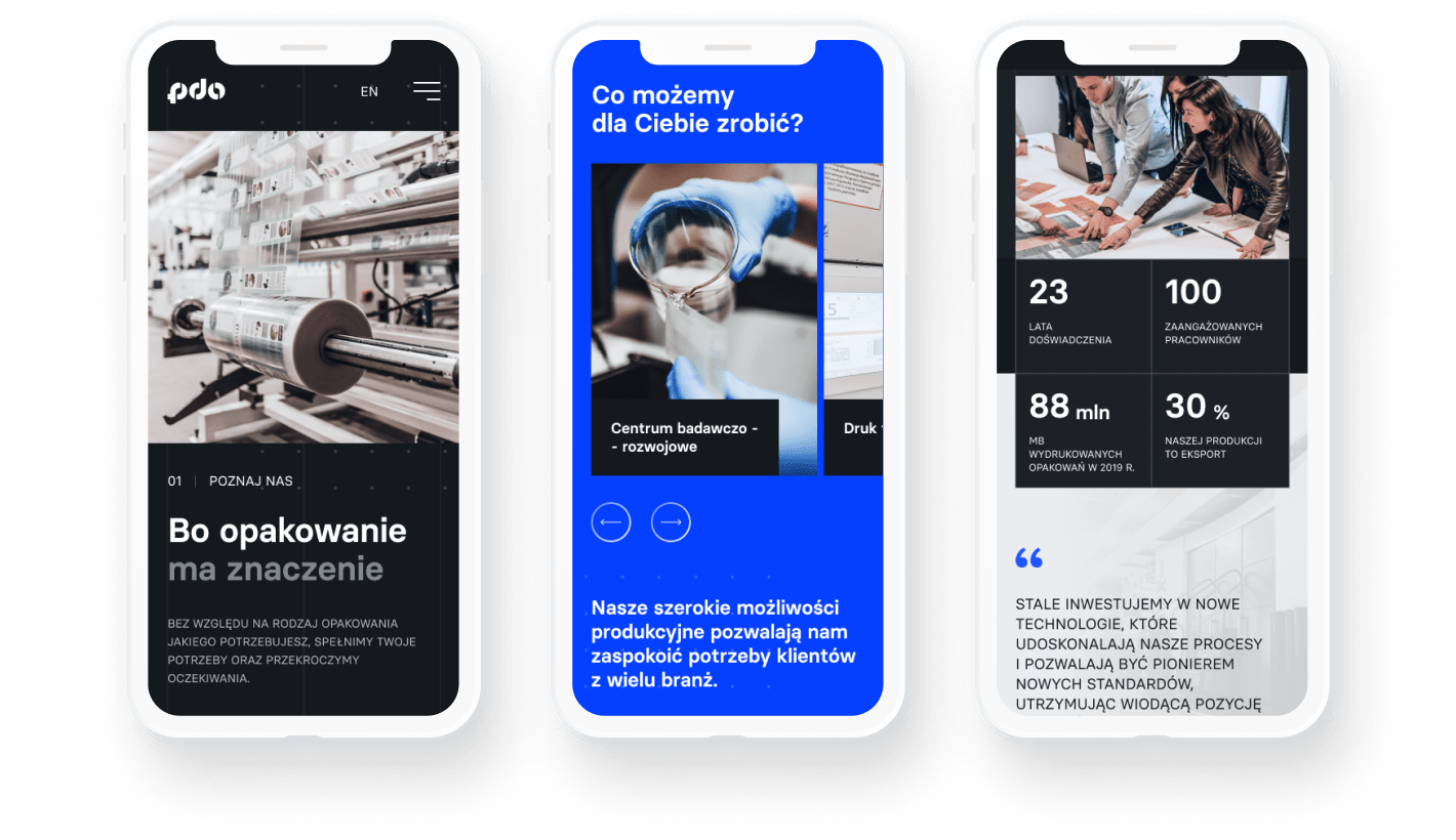
Stylish minimalism and unique color combinations reflect the contemporary character of the company. They give her image of professionalism.
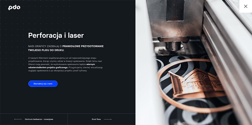
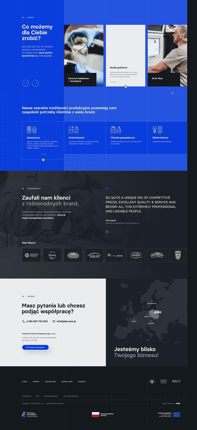
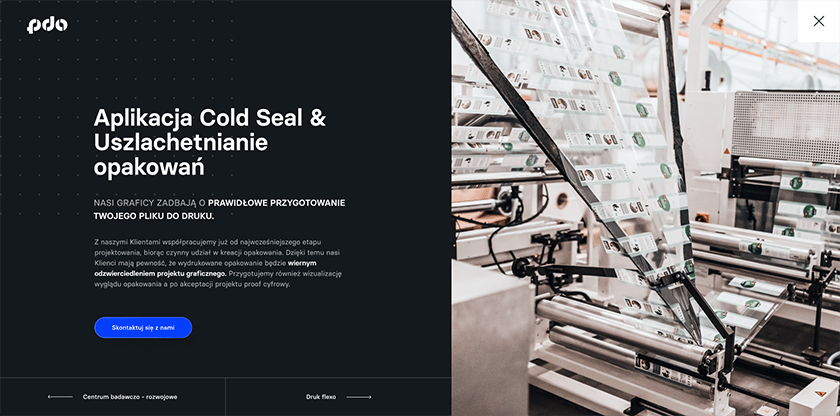

A dedicated set of icons and graphics illustrating the printing house's offer
Specially designed icons give the website a stylish look. Their functionality improves intuitive navigation of the portal. Graphics illustrating PDO's offer increase the attractiveness and build trust of the recipient, who receives a ready-made range of possibilities offered by the company.
Readability and transparency of information
The minimalist style we use allows us to convey maximum information. Thanks to consistency and maintained aesthetics, the website is clear and pleasant to read.

Adaptability to the mobile version
We made sure that our client could reach his audience on the widest possible scale. So we created a fully responsive and adaptive landing page that makes an equally positive impression on both a smartphone and a desktop.
Wordpress system
-
Easy to use A website with built in WordPress ensuring security and ease of use. Anyone with access to the panel can easily add or edit content.
-
Extensive possibilities Thanks to the functions of the WordPress system, our programmers created dedicated modules for the client, which allowed them to adapt to their individual needs and the specificity of the industry.


Editable PowerPoint presentation template
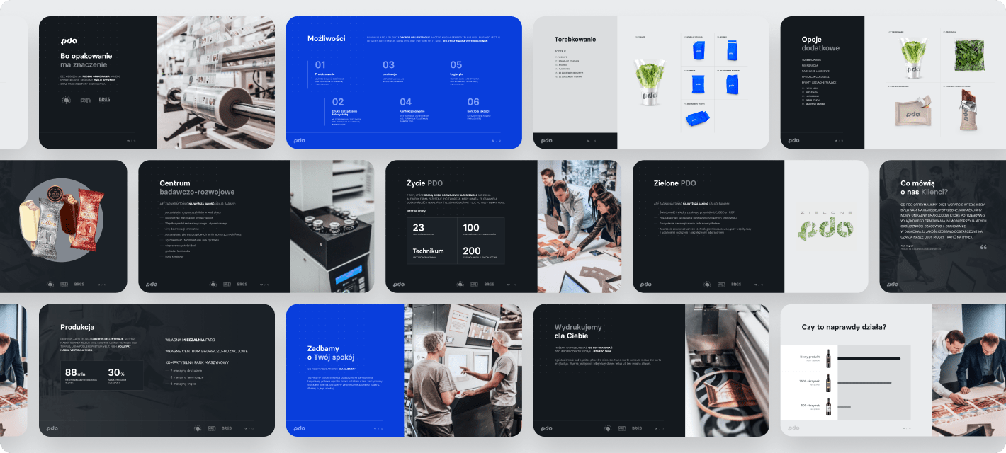
We made sure that our client could always use an easy to edit template and present the company at a high level.
Perfect first impression
Our client, using templates prepared by our team, can present their offer in a variety of attractive ways at speeches, fairs and business meetings.
Professional approach
We used graphic elements and a composition consistent with the company's image. Thanks to this, we have obtained a template that will be used to build positive relationships with the client.
Technologies used
The landing page was created based on the WordPress system. Proper and reliable preparation of this type of software translates into its high security and reliability. The WordPress system is also very flexible - it allows the client to make changes to the website on his own. All this thanks to an easy to use content management panel.
Write to us and...
Let's get to work!
We will gladly answer your questions and prepare a comprehensive cooperation offer!
;)
