Marmite
A leader in the production of bathroom products
Marmite is a world leader in the production of bathroom products made of technically advanced material - Mineral Composite.
The origins of the brand date back to 1975 - that's when Roger Johansson started producing elements made of plastic and polyurethane.
Today, Marmite products are available in 37 countries around the world - they are appreciated for their aesthetics, modernity and reliability, as evidenced by numerous awards such as: "Red Dot Design Award" and "If Design Award".
Purpose – Website
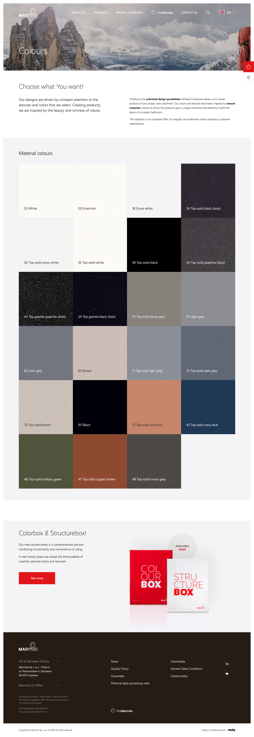
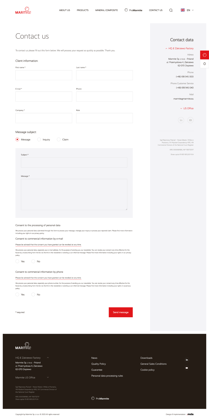
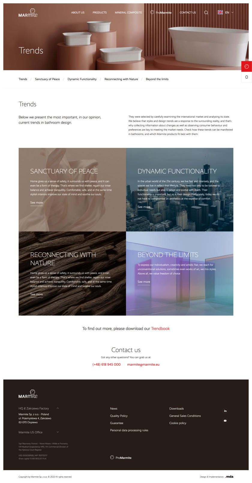
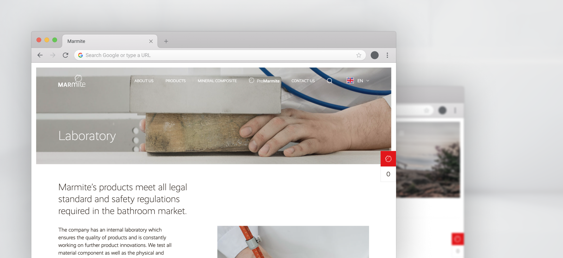
For Marmite, we have created a completely new website layout that is both transparent and aesthetic, and the entire website is fully functional and intuitive. The website is available in 7 language versions - Polish, German, French, Swedish, Italian, British English and American English.
Interactive graphics
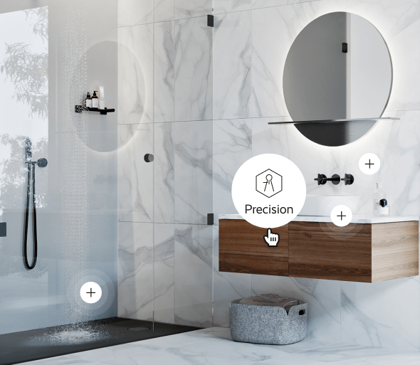
We know perfectly well how important a part of layout design is the appropriate selection of graphics. In the case of the project for Marmite, in addition to standard photos, videos and infographics, we also decided to use interactive graphics - in this case, clicking or hovering the cursor over the appropriate element reveals a window with additional content.
- An interesting form that encourages interaction Interactive graphics effectively attract the viewer's attention and encourage him to take further actions on the website. They are also a great carrier of information.
- No need to open an additional tab or window The ability to read additional, interesting content without having to open a new tab or window is an undoubted advantage for many people. The solution allows you to limit the number of links, making the page more organized.
Home page – a collection of the most important information
We have made every effort to ensure that the Marmite home page is a collection of all the most important information about the brand - a collection that not only encourages further reading, but also looks good and is the company's showcase.
Elements that attract attention
One of the key elements of the home page is a video and gif - moving graphics are designed to attract the visitor's eye and make him stay on the website longer.
A wealth of content
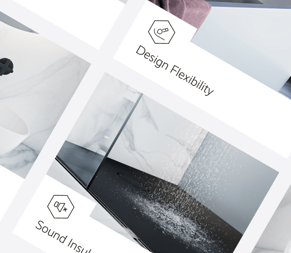
The website is full of information about both the brand itself and the products it offers. The presence of photos, icons and infographics makes the content easy and pleasant for the recipient.
Aesthetics, professionalism and transparency
…these are the three main features of the new Marmite website layout. A well-thought-out combination of colors, appropriate selection of graphics and perfectly selected icons create a refined, coherent whole.



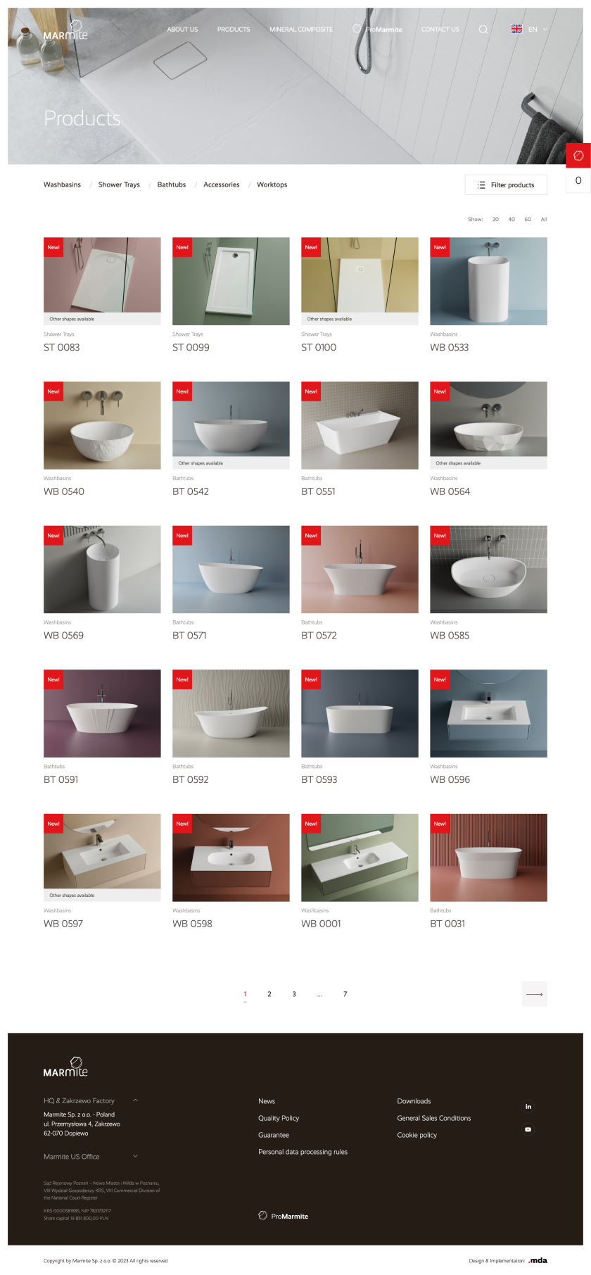
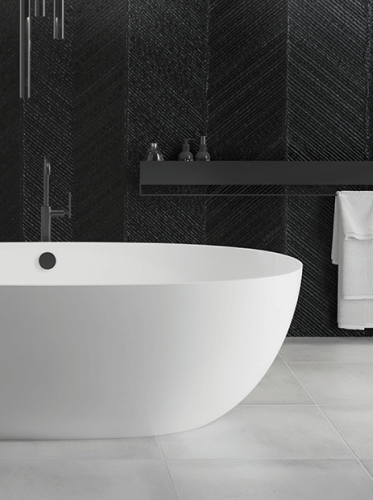
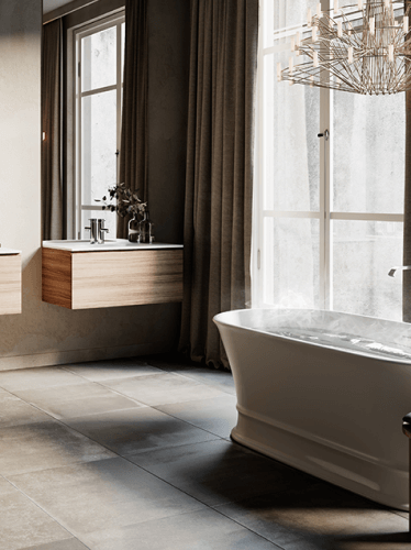
Photos in the highest quality
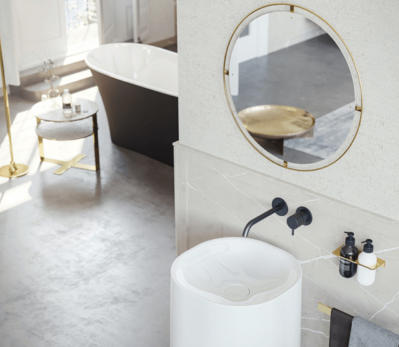
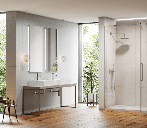
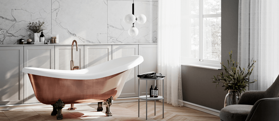
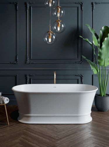
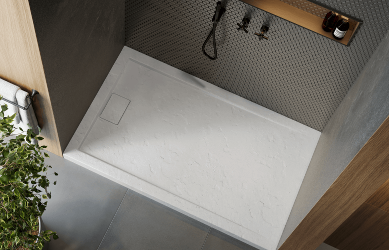
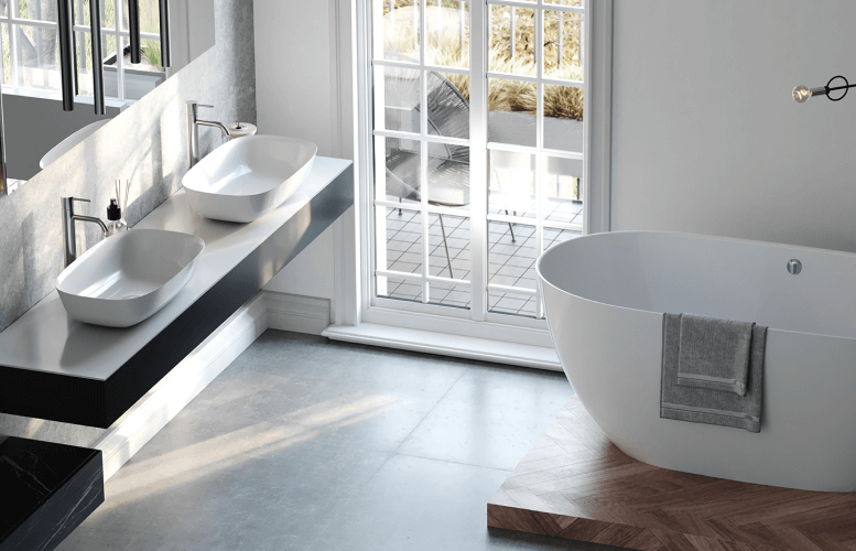
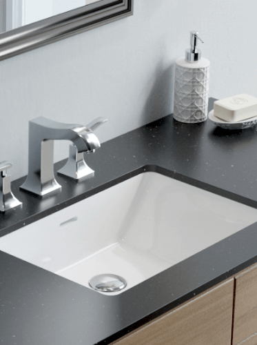
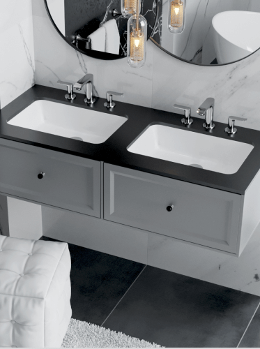
Marmite products are known for their high quality standard - we have made every effort to ensure that all photos posted on the website reflect this as best as possible.
Mineral Composite History
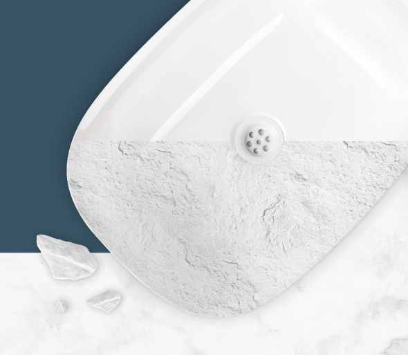
The revolutionary material is Marmite's invention and pride - it is to this technology that the brand's products owe their durability and smooth surface.
We made sure that this unusual material was properly highlighted and presented on the home page.
From design to reality
The cooperation with Marmite took place in a professional and friendly atmosphere - starting from the design and ending with its implementation.
A clear vision
Our priority was to create a design that would perfectly match the aesthetics and values of the brand.
Constant contact
This is an element that was certainly present at every stage of cooperation - constant communication allowed both the best possible understanding of the client's idea and the efficient implementation of changes.
Technologies used
The website is based on the Wordpress system - a safe and widely known content management tool.
Additionally, the following programming languages were used in the design process: HTML, CSS, JS and PHP.
Write to us and...
Let's get to work!
We will gladly answer your questions and prepare a comprehensive cooperation offer!
;)
